[시각화] Gantt 간트 차트 그리기
plotly.express로 간트 차트 그리기
import pandas as pd
import numpy as np
import plotly.express as px
import pandas as pd
# Create a DataFrame
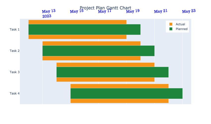
df = pd.DataFrame({
'Task': ['Task 1', 'Task 1', 'Task 2', 'Task 2', 'Task 3', 'Task 3', 'Task 4', 'Task 4'],
'Task Description': ['Gather', 'Gather', 'Create', 'Create', 'Collect', 'Collect', 'Process', 'Process'],
'Duration Type': ['Actual', 'Planned', 'Actual', 'Planned', 'Actual', 'Planned', 'Actual', 'Planned'],
'Start': ['2023-05-12', '2023-05-12', '2023-05-13', '2023-05-13', '2023-05-14', '2023-05-14', '2023-05-15', '2023-05-15'],
'Finish': ['2023-05-19', '2023-05-20', '2023-05-20', '2023-05-21', '2023-05-21', '2023-05-22', '2023-05-22', '2023-05-23']
})
df['Start'] = df['Start'].astype('datetime64')
df['Finish'] = df['Finish'].astype('datetime64')
colors = {}
colors['Planned'] =  'rgb(29, 133, 60)' #specify the color for the 'planned' schedule bars
colors['Actual'] = 'rgb(245, 148, 22)'  #specify the color for the 'actual' schedule bars

fig = px.timeline(
    df,
    x_start="Start",
    x_end="Finish",
    y="Task",
    color='Duration Type',
    color_discrete_map = colors,
    hover_name="Task Description"
    )

fig.update_yaxes(autorange="reversed")          #if not specified as 'reversed', the tasks will be listed from bottom up
fig.data[1].width=0.5 # update the width of the 'Actual' schedule bars (the second trace of the figure)
fig.show()

fig.update_layout(
                title='Project Plan Gantt Chart',
                bargap=0.1,
                width=850,
                height=500,
                xaxis_title="",
                yaxis_title="",
                title_x=0.5,
                legend_title="",
                legend = dict(orientation = 'v', xanchor = "center", x = 0.92, y= 0.98), #Adjust legend position
            )

fig.update_xaxes(tickangle=-5,side ="top",  tickfont=dict(family='Rockwell', color='blue', size=15))