[파이썬]캐글 타이타닉 데이터 탐색 #4(나이)
캐글 타이타닉 데이터 탐색 #4 (나이)
4번째 타이타닉 데이터 탐색을 해보려한다.
참고 : You Han Lee 유튜브
Age (나이)
print('제일 나이 많은 탑승객 : {:.1f} Years'.format(df_train['Age'].max()))
print('제일 어린 탑승객 : {:.1f} Years'.format(df_train['Age'].min()))
print('탑승객 평균 나이 : {:.1f} Years'.format(df_train['Age'].mean()))
제일 나이 많은 탑승객 : 80.0 Years
제일 어린 탑승객 : 0.4 Years
탑승객 평균 나이 : 29.7 Years
foo = df_train['Age']
# 밀도함수 분포도 그리기
fig, ax = plt.subplots(1, 1, figsize=(9,5))
sns.kdeplot(df_train[df_train['Survived'] == 1]['Age'], ax=ax)
sns.kdeplot(df_train[df_train['Survived'] == 0]['Age'], ax=ax)
plt.legend(['Survived == 1', 'Survived == 0'])
plt.show()

df_train[df_train['Survived'] == 1]['Age'].hist()
<matplotlib.axes._subplots.AxesSubplot at 0x7f49de14d6d8>
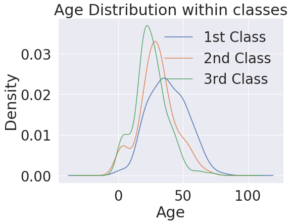
plt.figure(figsize=(8,6))
df_train['Age'][df_train['Pclass'] == 1].plot(kind='kde')
df_train['Age'][df_train['Pclass'] == 2].plot(kind='kde')
df_train['Age'][df_train['Pclass'] == 3].plot(kind='kde')

plt.xlabel('Age')
plt.title('Age Distribution within classes')
plt.legend(['1st Class', '2nd Class', '3rd Class'])
<matplotlib.legend.Legend at 0x7f49de07bc18>
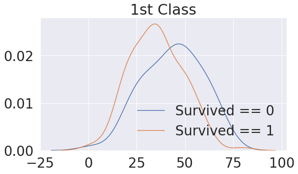
# 불린을 이용한 방법 1st Class
fig, ax = plt.subplots(1, 1, figsize=(9, 5))
sns.kdeplot(df_train[(df_train['Survived'] == 0) & (df_train['Pclass'] == 1)]['Age'], ax=ax)
sns.kdeplot(df_train[(df_train['Survived'] == 1) & (df_train['Pclass'] == 1)]['Age'], ax=ax)
plt.legend(['Survived == 0', 'Survived == 1'])
plt.title('1st Class')
Text(0.5, 1.0, '1st Class')
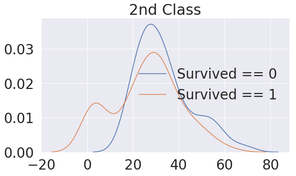
# 불린을 이용한 방법 2nd Class
fig, ax = plt.subplots(1, 1, figsize=(9, 5))
sns.kdeplot(df_train[(df_train['Survived'] == 0) & (df_train['Pclass'] == 2)]['Age'], ax=ax)
sns.kdeplot(df_train[(df_train['Survived'] == 1) & (df_train['Pclass'] == 2)]['Age'], ax=ax)
plt.legend(['Survived == 0', 'Survived == 1'])
plt.title('2nd Class')
Text(0.5, 1.0, '2nd Class')
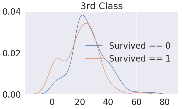
# 불린을 이용한 방법 3rd Class
fig, ax = plt.subplots(1, 1, figsize=(9, 5))
sns.kdeplot(df_train[(df_train['Survived'] == 0) & (df_train['Pclass'] == 3)]['Age'], ax=ax)
sns.kdeplot(df_train[(df_train['Survived'] == 1) & (df_train['Pclass'] == 3)]['Age'], ax=ax)
plt.legend(['Survived == 0', 'Survived == 1'])
plt.title('3rd Class')
Text(0.5, 1.0, '3rd Class')
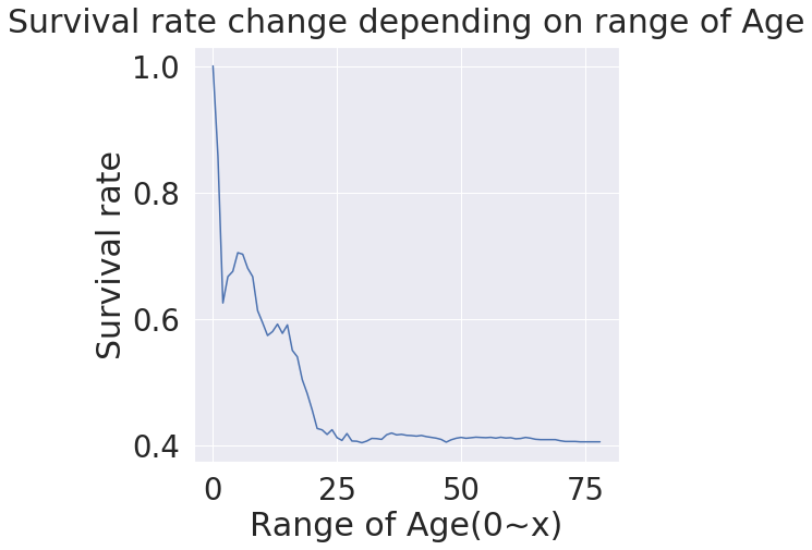
# 나이별 생존확률 그래프
change_age_range_survival_ratio = []

for i in range(1, 80):
    change_age_range_survival_ratio.append(df_train[df_train['Age'] < i]['Survived'].sum() / len(df_train[df_train['Age'] < i]['Survived']))

plt.figure(figsize=(7, 7))
plt.plot(change_age_range_survival_ratio)
plt.title('Survival rate change depending on range of Age', y=1.02)
plt.ylabel('Survival rate')
plt.xlabel('Range of Age(0~x)')
plt.show()