[파이썬]캐글 타이타닉 데이터 탐색 #1 #2
캐글 타이타닉 데이터 탐색
파이썬으로 데이터 탐색하는 것을 해보려한다. 맨날 SQL과 엑셀로만 데이터분석을 해서 약간 실력도 줄어드는 것 같아서… 좋은 유튜브 영상이 있어서 따라서 해보려 한다.
참고 : You Han Lee 유튜브
(참고)쥬피터 노트북 깃허븡 블로그에 올리기
그리고 쥬피터 노트북을 바로 github post에 올리는 법을 몰랐는데 GitHub 블로그에 Jupyter notebook 올리는 방법 여기 블로그를 보고 참고했다. 아직은 자동화방법은 모르겠어서 나중으로 미루려고한다 ㅎㅎ 하….
import numpy as np # 연산
import pandas as pd # 데이터 프레임
import matplotlib.pyplot as plt # 비쥬얼라이징
import seaborn as sns # 비쥬얼라이징

# 여기서 부터는 한방에 스타일 만들기
plt.style.use('seaborn') # 디폴트가 아니고 시본 스타일로 나온다.
sns.set(font_scale=2.5) # 그림 계속 사이즈 조정하기 귀찮아서
import missingno as msno

# ignore warnings
import warnings
warnings.filterwarnings('ignore') # 업그레이드 했으면 좋겠다 이런거 무시

# matplot 쓸 때, show를 하면 윈도우가 나타나는데 이 노트북에 바로바로 볼수 있게 끔
%matplotlib inline
# 싸이키런이라는 라이브러리를 써야한다. 모르면 안된다. 파이썬을 활용한 머신러닝이라는 책이 있는데 꼭 봐야한다.
df_train = pd.read_csv('../input/train.csv')
df_test = pd.read_csv('../input/test.csv')
df_train.head() # 데이터 확인
| PassengerId | Survived | Pclass | Name | Sex | Age | SibSp | Parch | Ticket | Fare | Cabin | Embarked | |
|---|---|---|---|---|---|---|---|---|---|---|---|---|
| 0 | 1 | 0 | 3 | Braund, Mr. Owen Harris | male | 22.0 | 1 | 0 | A/5 21171 | 7.2500 | NaN | S |
| 1 | 2 | 1 | 1 | Cumings, Mrs. John Bradley (Florence Briggs Th... | female | 38.0 | 1 | 0 | PC 17599 | 71.2833 | C85 | C |
| 2 | 3 | 1 | 3 | Heikkinen, Miss. Laina | female | 26.0 | 0 | 0 | STON/O2. 3101282 | 7.9250 | NaN | S |
| 3 | 4 | 1 | 1 | Futrelle, Mrs. Jacques Heath (Lily May Peel) | female | 35.0 | 1 | 0 | 113803 | 53.1000 | C123 | S |
| 4 | 5 | 0 | 3 | Allen, Mr. William Henry | male | 35.0 | 0 | 0 | 373450 | 8.0500 | NaN | S |
# 데이터프레임 객체입니다.
df_train.describe()
| PassengerId | Survived | Pclass | Age | SibSp | Parch | Fare | |
|---|---|---|---|---|---|---|---|
| count | 891.000000 | 891.000000 | 891.000000 | 714.000000 | 891.000000 | 891.000000 | 891.000000 |
| mean | 446.000000 | 0.383838 | 2.308642 | 29.699118 | 0.523008 | 0.381594 | 32.204208 |
| std | 257.353842 | 0.486592 | 0.836071 | 14.526497 | 1.102743 | 0.806057 | 49.693429 |
| min | 1.000000 | 0.000000 | 1.000000 | 0.420000 | 0.000000 | 0.000000 | 0.000000 |
| 25% | 223.500000 | 0.000000 | 2.000000 | 20.125000 | 0.000000 | 0.000000 | 7.910400 |
| 50% | 446.000000 | 0.000000 | 3.000000 | 28.000000 | 0.000000 | 0.000000 | 14.454200 |
| 75% | 668.500000 | 1.000000 | 3.000000 | 38.000000 | 1.000000 | 0.000000 | 31.000000 |
| max | 891.000000 | 1.000000 | 3.000000 | 80.000000 | 8.000000 | 6.000000 | 512.329200 |
df_train.shape
(891, 12)
df_test.describe()
| PassengerId | Pclass | Age | SibSp | Parch | Fare | |
|---|---|---|---|---|---|---|
| count | 418.000000 | 418.000000 | 332.000000 | 418.000000 | 418.000000 | 417.000000 |
| mean | 1100.500000 | 2.265550 | 30.272590 | 0.447368 | 0.392344 | 35.627188 |
| std | 120.810458 | 0.841838 | 14.181209 | 0.896760 | 0.981429 | 55.907576 |
| min | 892.000000 | 1.000000 | 0.170000 | 0.000000 | 0.000000 | 0.000000 |
| 25% | 996.250000 | 1.000000 | 21.000000 | 0.000000 | 0.000000 | 7.895800 |
| 50% | 1100.500000 | 3.000000 | 27.000000 | 0.000000 | 0.000000 | 14.454200 |
| 75% | 1204.750000 | 3.000000 | 39.000000 | 1.000000 | 0.000000 | 31.500000 |
| max | 1309.000000 | 3.000000 | 76.000000 | 8.000000 | 9.000000 | 512.329200 |
1. Data Null값 확인
df_train.columns
Index(['PassengerId', 'Survived', 'Pclass', 'Name', 'Sex', 'Age', 'SibSp',
       'Parch', 'Ticket', 'Fare', 'Cabin', 'Embarked'],
      dtype='object')
for col in df_train.columns:
    msg = 'column : {:>11} \t Percent of NAN value : {:.2f}%'.format(col, 100*(df_train[col].isnull().sum() / df_train[col].shape[0]))
    print(msg)
# {:>11} 이건 오른쪽 정렬이고 11은 몇 자리 공간을 둘껀지
# {}이게 그다음 포맷에 들어갈 자리에다가 포맷
# isnull의 개수/전체shape(행)갯수=obs갯수
column : PassengerId 	 Percent of NAN value : 0.00%
column :    Survived 	 Percent of NAN value : 0.00%
column :      Pclass 	 Percent of NAN value : 0.00%
column :        Name 	 Percent of NAN value : 0.00%
column :         Sex 	 Percent of NAN value : 0.00%
column :         Age 	 Percent of NAN value : 19.87%
column :       SibSp 	 Percent of NAN value : 0.00%
column :       Parch 	 Percent of NAN value : 0.00%
column :      Ticket 	 Percent of NAN value : 0.00%
column :        Fare 	 Percent of NAN value : 0.00%
column :       Cabin 	 Percent of NAN value : 77.10%
column :    Embarked 	 Percent of NAN value : 0.22%
for col in df_test.columns:
    msg = 'column : {:>11} \t Percent of NAN value : {:.2f}%'.format(col, 100*(df_test[col].isnull().sum() / df_test[col].shape[0]))
    print(msg)
column : PassengerId 	 Percent of NAN value : 0.00%
column :      Pclass 	 Percent of NAN value : 0.00%
column :        Name 	 Percent of NAN value : 0.00%
column :         Sex 	 Percent of NAN value : 0.00%
column :         Age 	 Percent of NAN value : 20.57%
column :       SibSp 	 Percent of NAN value : 0.00%
column :       Parch 	 Percent of NAN value : 0.00%
column :      Ticket 	 Percent of NAN value : 0.00%
column :        Fare 	 Percent of NAN value : 0.24%
column :       Cabin 	 Percent of NAN value : 78.23%
column :    Embarked 	 Percent of NAN value : 0.00%
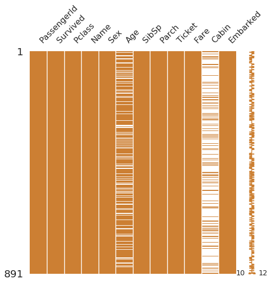
msno.matrix(df=df_train.iloc[:, :], figsize=(8, 8), color=(0.8, 0.5, 0.2))
# 미싱노 라이브러리 사용
# [:,:] 다 가져오겠다. 1로 2로 막 바꿔보셈
# iloc 인덱싱하는거
# null 데이터의 분포, 위치를 보고싶을때,
<matplotlib.axes._subplots.AxesSubplot at 0x7fe1d1f741d0>
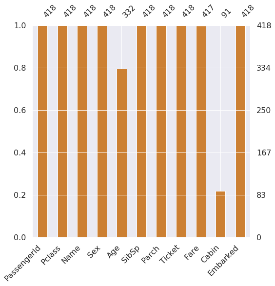
msno.bar(df=df_test.iloc[:, :], figsize=(8, 8), color=(0.8, 0.5, 0.2))
# 몇 퍼센트의 Null 데이터가 있는지 확인
<matplotlib.axes._subplots.AxesSubplot at 0x7fe1d2f50e10>
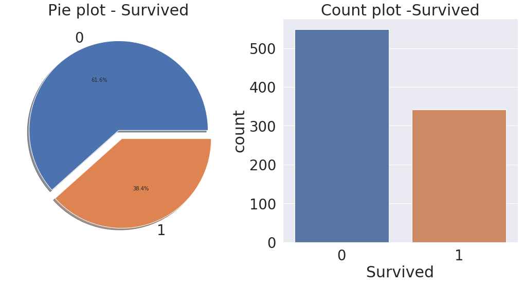
# 타겟레이블이 얼마만큼 밸런스되어 있는가? 어떤 분포인지?
f, ax = plt.subplots(1, 2, figsize=(18,8)) # 도화지를 꺼내는 과정 row = 1, column = 2 하나의 행에 두개의 그림, 사이즈는 가로 18 x 세로 8

df_train['Survived'].value_counts().plot.pie(explode=[0,0.1], autopct='%1.1f%%', ax=ax[0], shadow=True)
# explode 째는거, 퍼센트, ax[0] - 어디도화지에 그릴것인가, shawdow - 그림자
ax[0].set_title('Pie plot - Survived')
ax[0].set_ylabel('')
sns.countplot('Survived', data=df_train, ax=ax[1]) # count수 세기
ax[1].set_title('Count plot -Survived')
plt.show()
2.1 Pclass
df_train[['Pclass', 'Survived']].groupby(['Pclass'], as_index=True).count()
| Survived | |
|---|---|
| Pclass | |
| 1 | 216 |
| 2 | 184 |
| 3 | 491 |
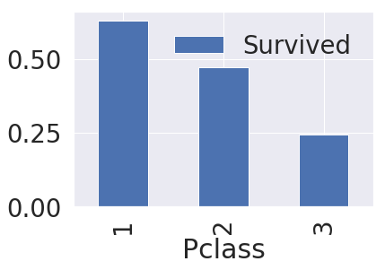
df_train[['Pclass', 'Survived']].groupby(['Pclass'], as_index=True).mean()
| Survived | |
|---|---|
| Pclass | |
| 1 | 0.629630 |
| 2 | 0.472826 |
| 3 | 0.242363 |
pd.crosstab(df_train['Pclass'], df_train['Survived'], margins=True).style.background_gradient(cmap='winter')
# margins 토탈이 있냐 없냐. # style 이거는 그냥 색깔
| Survived | 0 | 1 | All |
|---|---|---|---|
| Pclass | |||
| 1 | 80 | 136 | 216 |
| 2 | 97 | 87 | 184 |
| 3 | 372 | 119 | 491 |
| All | 549 | 342 | 891 |
df_train['Survived'].unique()
array([0, 1])
df_train[['Pclass', 'Survived']].groupby(['Pclass'], as_index=True).mean().sort_values(by='Survived', ascending=False).plot.bar()
# 아래에 왜 index를 트루로 해야하는지 알수있다.
<matplotlib.axes._subplots.AxesSubplot at 0x7fe1bff6ea58>
df_train[['Pclass', 'Survived']].groupby(['Pclass'], as_index=False).mean().sort_values(by='Survived', ascending=False).plot.bar()
<matplotlib.axes._subplots.AxesSubplot at 0x7fe1c423cba8>
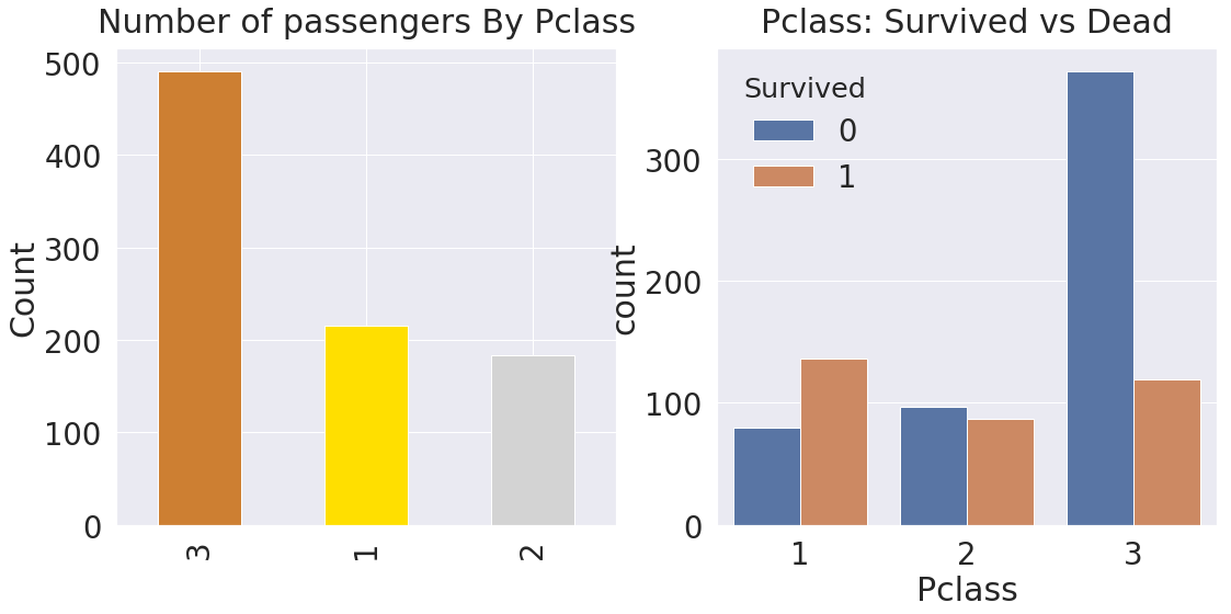
y_position = 1.02
f, ax = plt.subplots(1, 2, figsize=(18,8))
df_train['Pclass'].value_counts().plot.bar(color=['#CD7F32', '#FFDF00', '#D3D3D3'], ax=ax[0])
ax[0].set_title('Number of passengers By Pclass', y=y_position)
ax[0].set_ylabel('Count')
sns.countplot('Pclass', hue='Survived', data=df_train, ax=ax[1]) # hue - 색으로 구분해서 나타나게 해준다.
ax[1].set_title('Pclass: Survived vs Dead', y=y_position)
plt.show()